The Beauty of Maps
 Documentary series looking at maps in incredible detail to highlight their artistic attributions and reveal the stories that they tell. The Beauty of Maps (Seeing the Art in Cartography) is yet another example of a BBC television series which focuses on matters concerning data visualization. It is another proof how visualization is becoming an interesting feature in popular press. We love maps. And we love data visualization, of which maps are among the earliest and most ubiquitous examples.
As location continues to tickle the tips of trend analysts' tongues and location-based applications take over the mobile landscape, it's interesting - if not necessary - to understand the historical context of our relationship with location and geography.
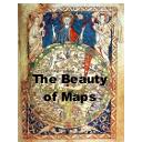
1. Medieval Maps – Mapping the Medieval Mind. The Hereford Mappa Mundi is the largest intact Medieval wall map in the world and its ambition is breathtaking – to picture all of human knowledge in a single image. The work of a team of artists, the world it portrays is overflowing with life, featuring Classical and Biblical history, contemporary buildings and events, animals and plants from across the globe, and the infamous 'monstrous races' which were believed to inhabit the remotest corners of the Earth.
2. City Maps – Order out of Chaos. The British Library is home to a staggering 4.5 million maps, most of which remain hidden away in its colossal basement, and the programme delves behind the scenes to explore some amazing treasures in more detail. This is the story of three maps, three 'visions' of London over three centuries; visions of beauty that celebrate but also distort the truth. It's the story of how urban maps try to impose order on chaos.
3. Atlas Maps – Thinking Big. The Dutch Golden Age saw map-making reach a fever pitch of creative and commercial ambition. This was the era of the first ever atlases – elaborate, lavish and beautiful. This was the great age of discovery and marked an unprecedented opportunity for mapmakers, who sought to record and categorize the newly acquired knowledge of the world.
4. Cartoon Maps – Politics and Satire. The series concludes by delving into the world of satirical maps. How did maps take on a new form, not as geographical tools, but as devices for humor, satire or storytelling? Graphic artist Fred Rose perfectly captured the public mood in 1880 with his general election maps featuring Gladstone and Disraeli, using the maps to comment upon crucial election issues still familiar to us today. Technology was on the satirist's side, with the advent of high-speed printing allowing for larger runs at lower cost.


An absolutely fantastic effort to depict some cartographical achievements. Left me wanting to see more, especially about Chinese and Middle east early map makers.
god I love maps
too bad the BBC hates me
Grayson's a pretentious *****
13th century..?? the rest of the peoples were well aware of the world. while still the Europeans were dumb about their surroundings.
No offense to map lovers but couldn't watch more than the first episode. Too boring and slow for my taste.
Tnx <3
Love to learn something new. This one did that and more.Thanks for posting.
A++. I loved looking at this. Paused and stared with fascination, several times.
lol BOBBERT
Nice series. Some of the old maps were really interesting.
I learned that the cartoonish maps of countries have an actual name "satirical maps".
This and "The Beauty of Diagrams" are just top drawer BBC.
Finally,, a cure for my insomnia!
Much <3 for putting this documentary on the site! As a longtime map enthusiast and current GIS student, I found this one to be quite amazing!